Spatial Data Analysis with R
Society for Conservation GIS, July 2021
Working with Color 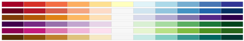
Working with Color
Color values are typically used in plot() functions.
Common arguments for colors include:
col: symbol color (for polygons)
border: outline color (for a polygon)
fill: fill color (ggplot)
Color values in R can be referred to by:
palette() returns 8 commonly used color names
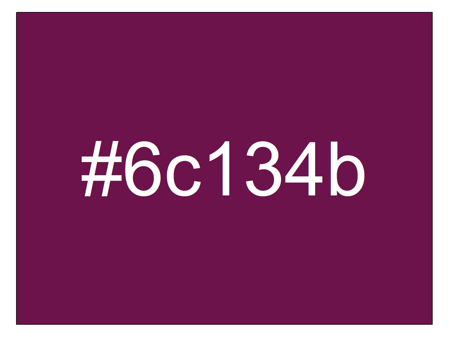
Hexadecimal values should be entered as text, including the ‘#’, e.g., “#00A949”
To make a fill, outline, or background transparent, set the color to NA.
R also supports semi-transparent colors. Look for an alpha argument in color functions, or append a 0-255 alpha value at the end of a hexidecimal code (where 0 = opaque, 255 = completely transparent).
### Transparency Example ----------------------

# Create points for a circle
theta <- seq(from=0, to=2*pi, length.out=36)
xs <- cos(theta)
ys <- sin(theta)

# Create an empty plot
plot(NULL, xlim=c(-1,1), ylim=c(-1,1), xlab=NA, ylab=NA, asp=1)

# Plot two overlapping circles each of which is 50% transparent
blue_semitrans <- "#0000ff80"
red_semitrans <-  "#ff000080"
polygon(x=xs + 0.5, y=ys, col=blue_semitrans)
polygon(x=xs - 0.5, y=ys, col=red_semitrans)![]()
Modify the code above, using different transparency values (i.e., change the last two characters of the color values).
Not all graphic file formats preserve transparency (e.g., JPG).
If you pass one value, all objects in the plot will have the same color.

If you pass multiple color values, the colors will be repeated as needed until there is one color for each feature.
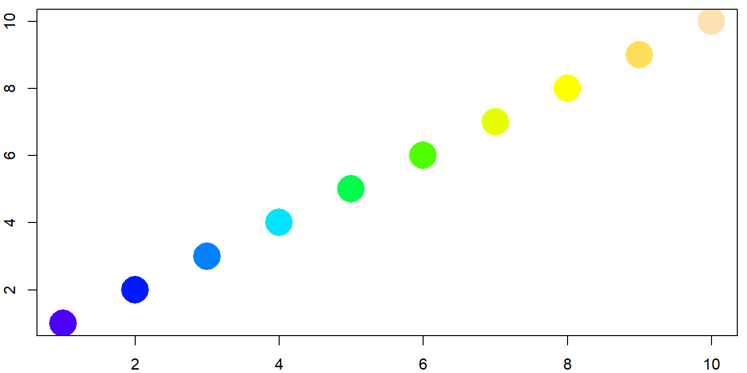
## Twelve points, three colors
plot(x=1:12, y=rep(1,12), pch=20, cex=3, xlab="", ylab="", col=c("red", "blue", "green"))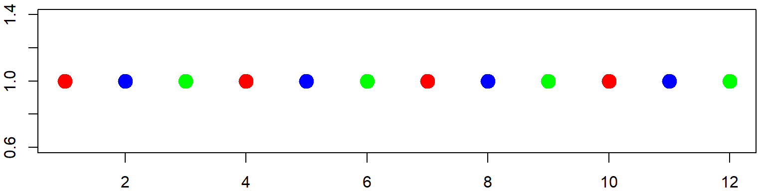
If you want each feature to have a different color, pass the same number of color values as objects in the plot.
## Twelve points, twelve colors
plot(x=1:12, y=rep(1,12), pch=20, cex=3, xlab="", ylab="", col=topo.colors(12))
Usually, you can also pass a vector of color values, which R will use to color features separately (repeating the color values as needed). R has several built-in functions that return vectors of colors. Color palettes where there color blend into each other are known as Color Ramps.
rainbow(n)
heat.colors(n)
terrain.colors(n)
topo.colors(n)
Most of these functions take a numeric argument n for the number of color values to return.
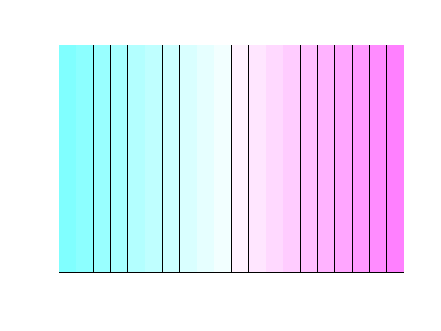
### Plot with terrain colors

par(mar=rep(0,4))
barplot(height=rep(1,20), col=terrain.colors(20), axes=FALSE, space=0)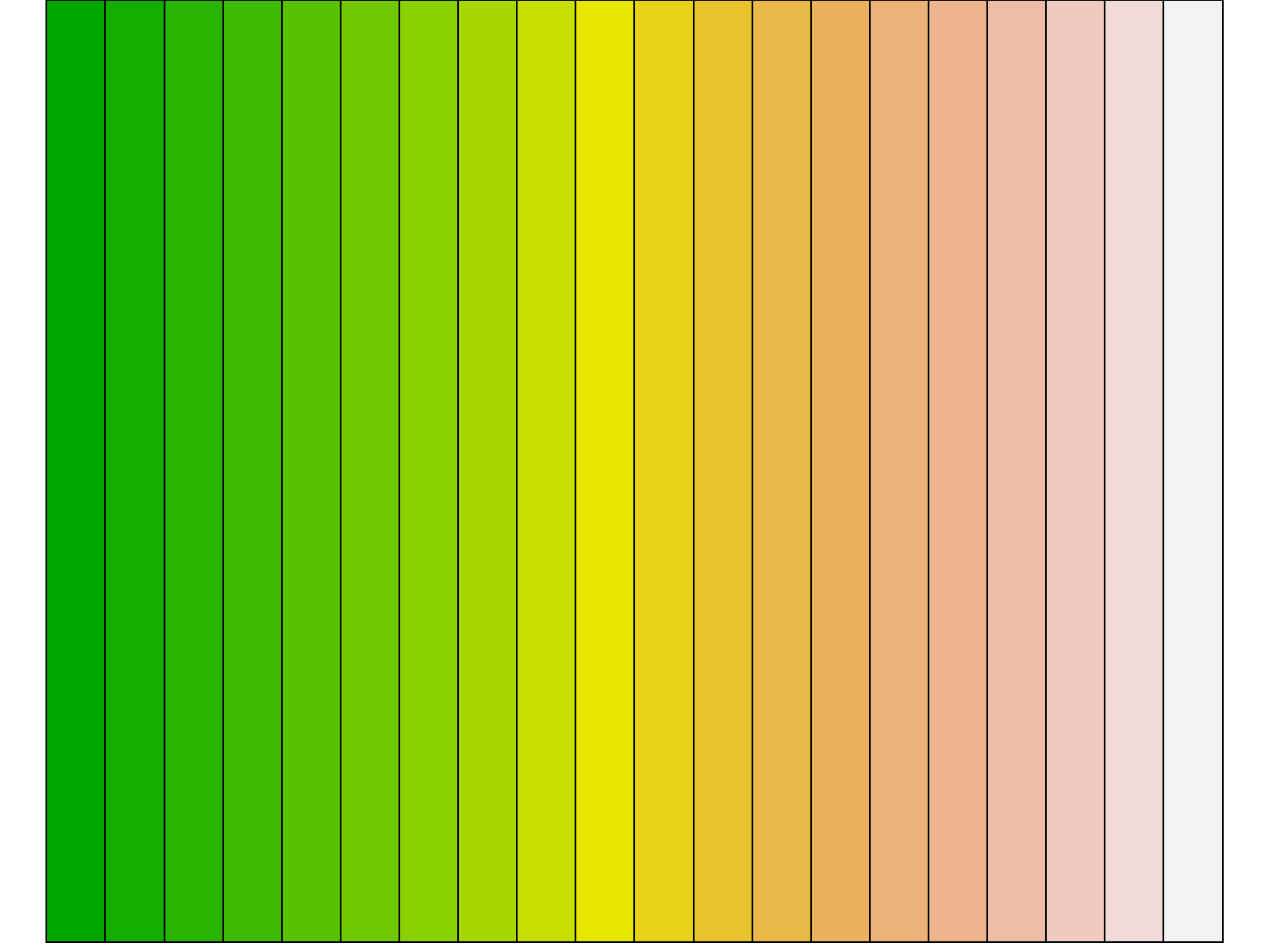
Replicate the bar plot above with a different color palette.
Create a vector of 10 gray values, from pure black to pure white.
[Solution]
For a non-repeating rainbow palette that ends at magenta, try:
rainbow(n, end=5/6)
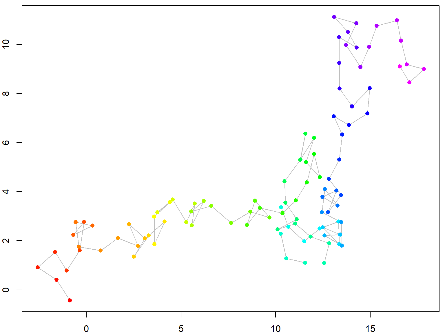
Plot a ‘random walk’ using a color ramp, to help the viewer connect the dots.
## Create Points that Simulate a Random Walk

start <- c(0,0)
n <- 100
theta <- runif(n, min=0, max=2*pi)  ## Generate 100 random angles
dist <- rnorm(n, mean=5, sd=0.5)    ## Generate 100 random distances
xy <- data.frame(x = start[1] + cumsum(dist * cos(theta)),
                 y = start[2] + cumsum(dist * sin(theta)))
plot(xy, type="b", pch=16)

## Modify the plot using a color ramp of your choice
# plot(xy, type="b", pch=16, col=??????)
[Solution]
You can make a custom color ramp using colorRampPalette(). Something unusual about this and other color ramp functions is that it returns a function. For example,
## [1] "#FFFF00" "#FFBF00" "#FF7F00" "#FF3F00" "#FF0000"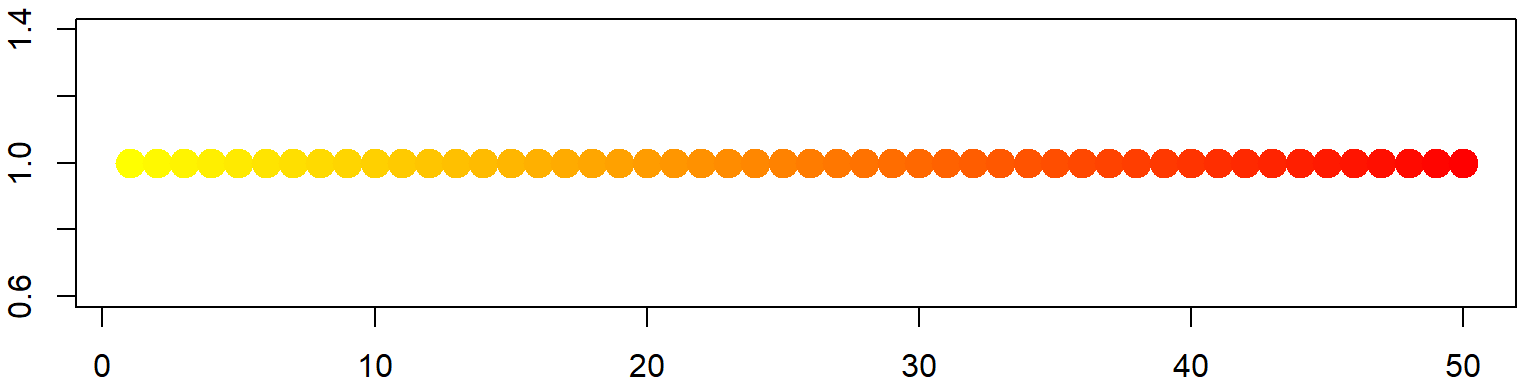
RColorBrewer has eight color palettes designed for categorical or qualitative data. These palettes have 8-12 colors each. For example the ‘Paired’ palette looks like:
colors_qual_paired <- RColorBrewer::brewer.pal(8, "Paired")
par(mar=rep(0,4))
barplot(height=rep(1,8), col=colors_qual_paired, axes=FALSE, space=0)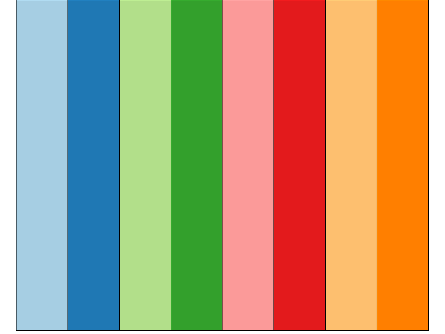
The following expression returns a vector of 433 colors excluding shades of gray. You can draw a random sample from this list with sample() to get a palette for categorical data.
You can also get more than a dozen qualitative colors using tmaptools::get_brewer_pal()